Overview
Wake Up Mentoring, established in 2007, helps at risk youth within the Juvenile Justice Sytem in Orange County and surrounding counties in Florida. Their mission is to mentor students and provide resources to help children with higher educational enrollment and employment.
Team:
Renee
Graphic Design and UX Design
Cole
Accessibility & UX Design
Jenny
Copywriter
Christina
Graphic Design
Our Goal was to improve the:
Accessibility
Brand Identity
Navigation
Call To Action
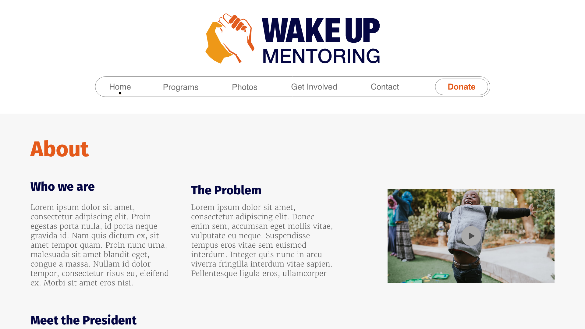
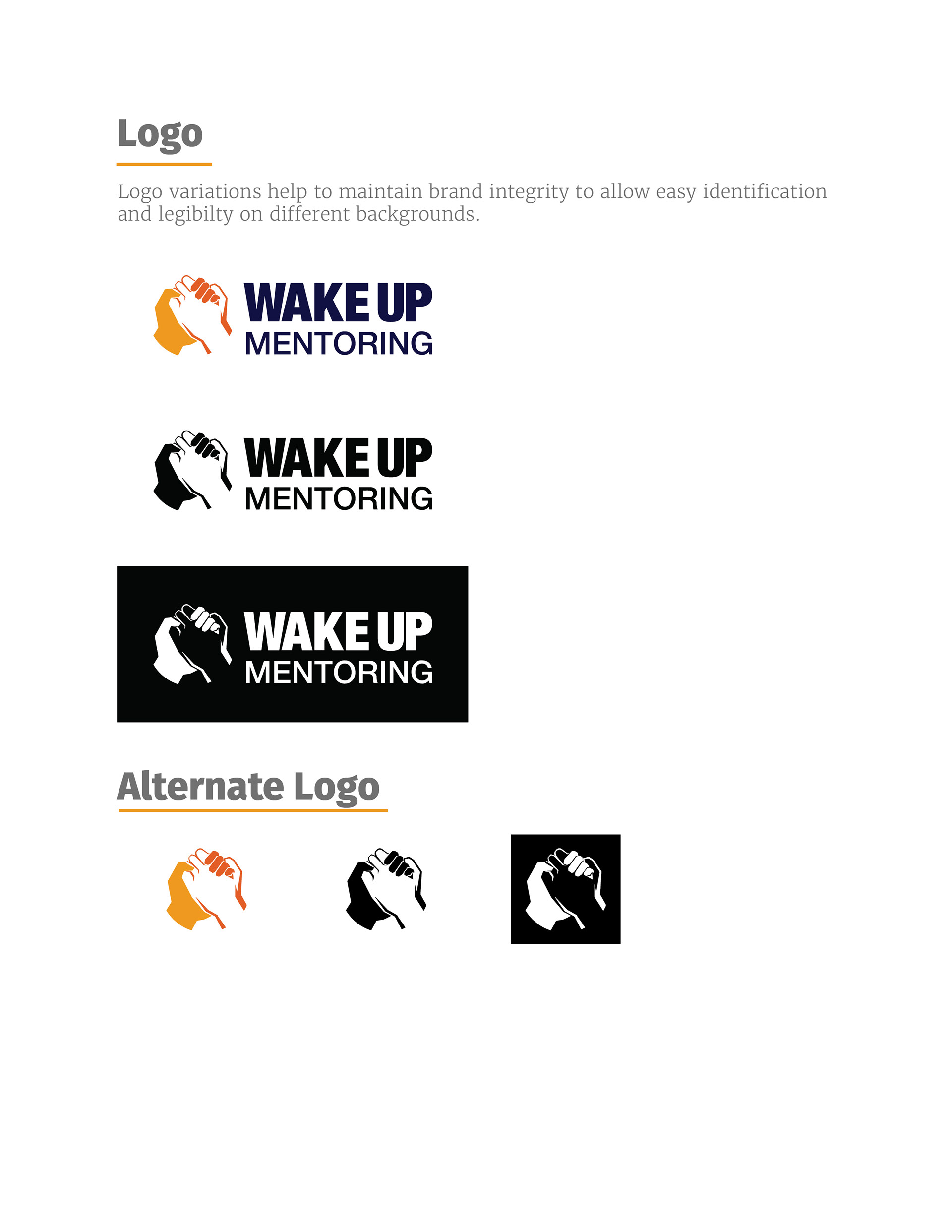
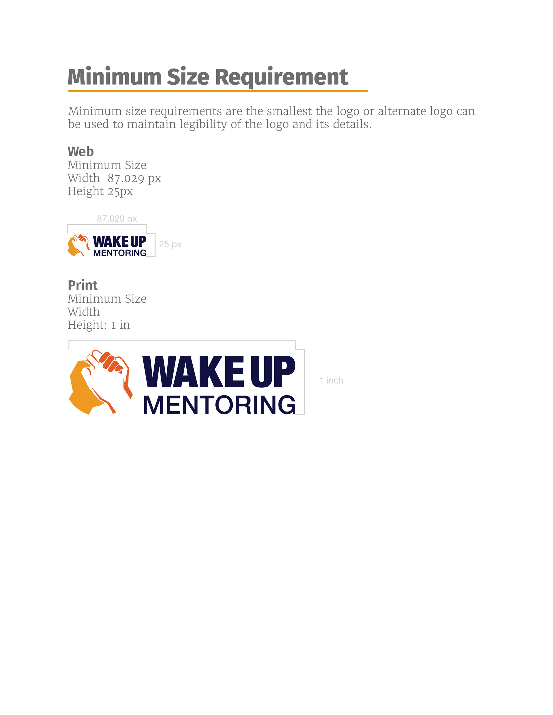
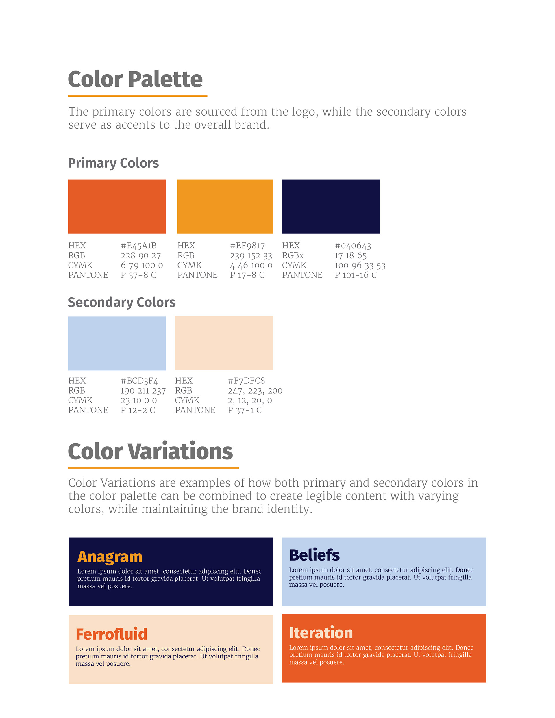
Style Guide and Brand Identity
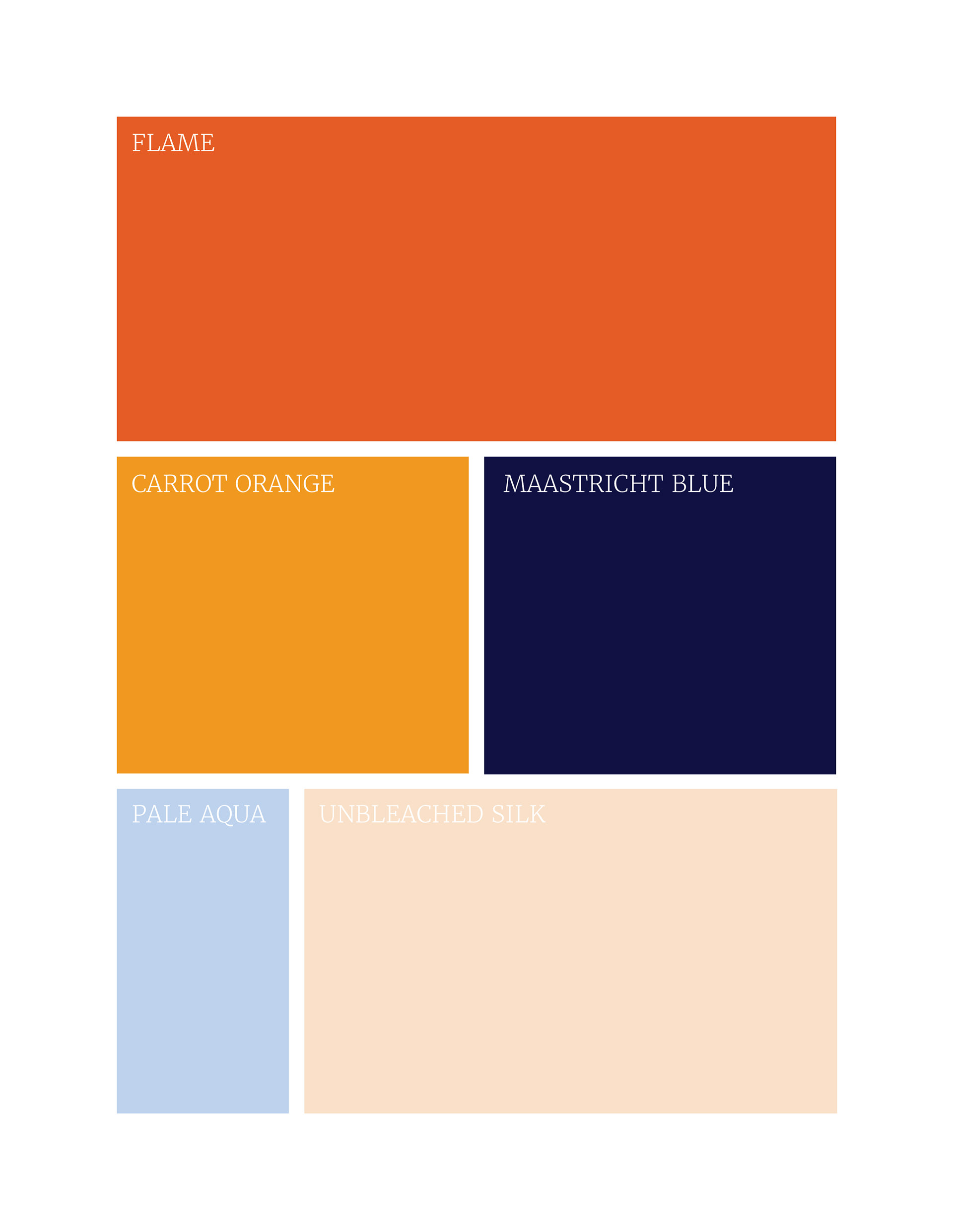
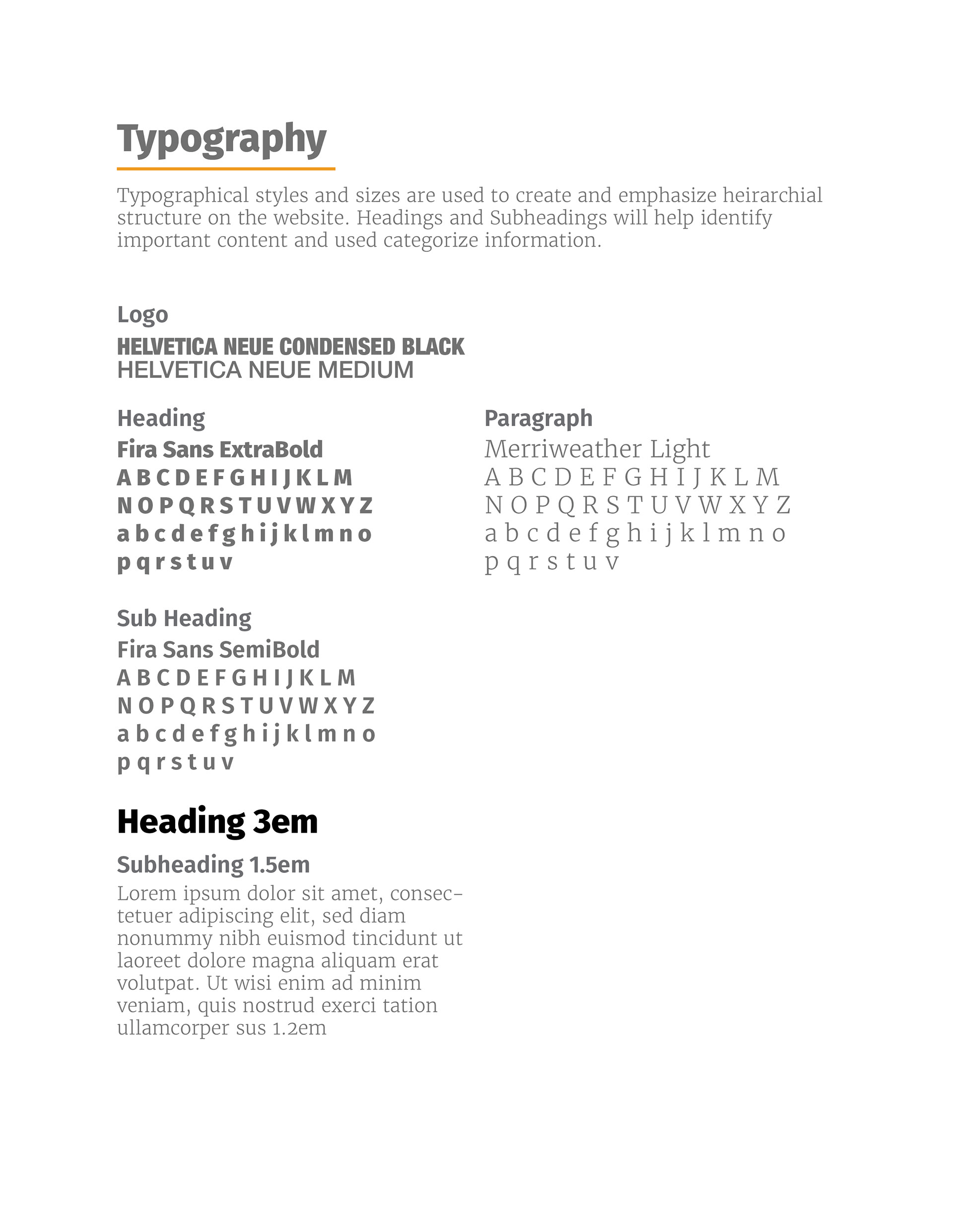
Working with the original logo design, I have worked on a brand identity based on the three colors presented and generated two secondary colors to pair with them. The typographical choices were based on their target audience and to further simplify the content presentation with the use of a simple serif for body content a body sans serif for headers.
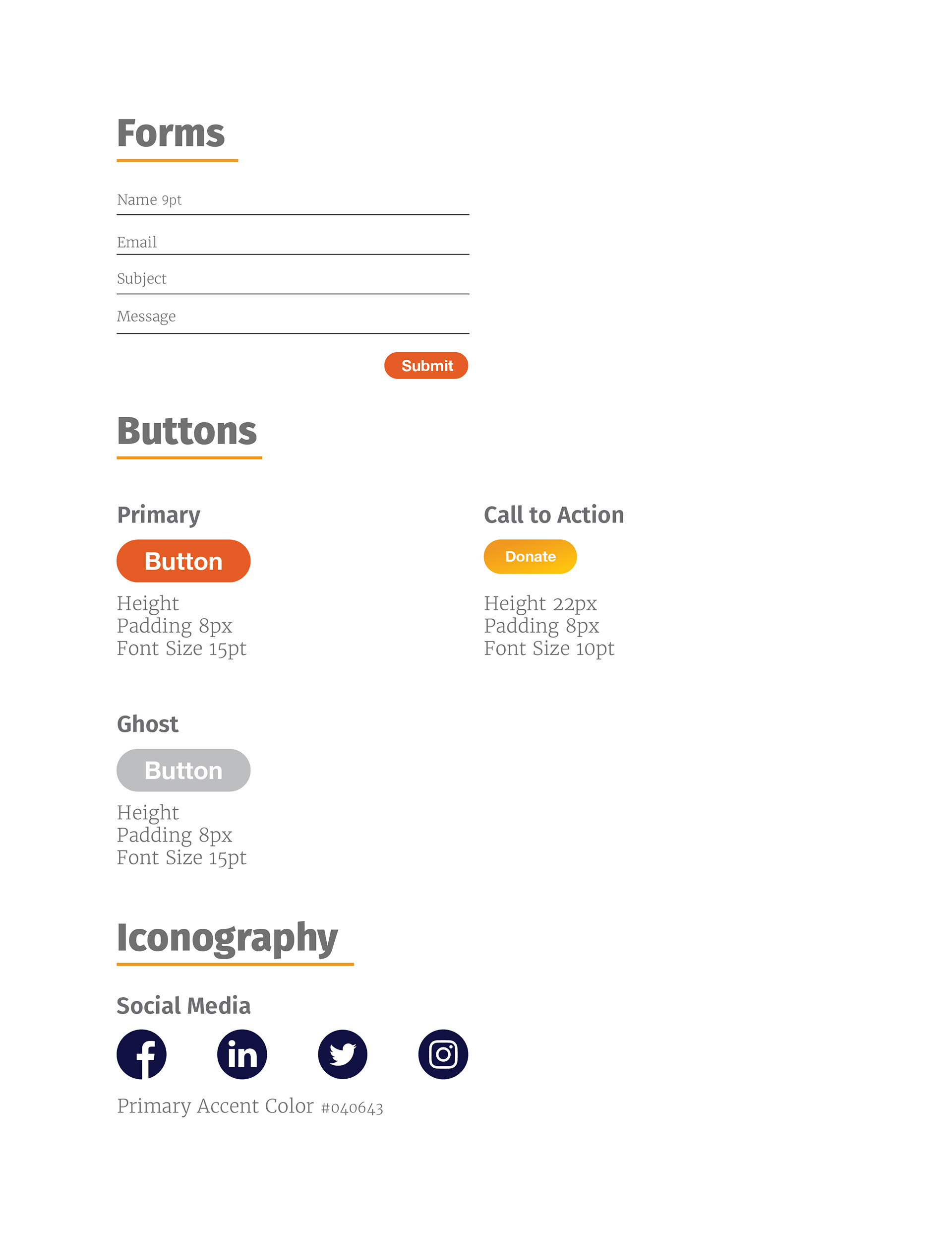
Implementing the style guide has created a standard of visual consistency for content layout, and color pairings to improve content legibility and hierarchy. Color variations were created to enhance contrast between both text and background and buttons to highlight CTAs.

Content Hierarchy and HCI
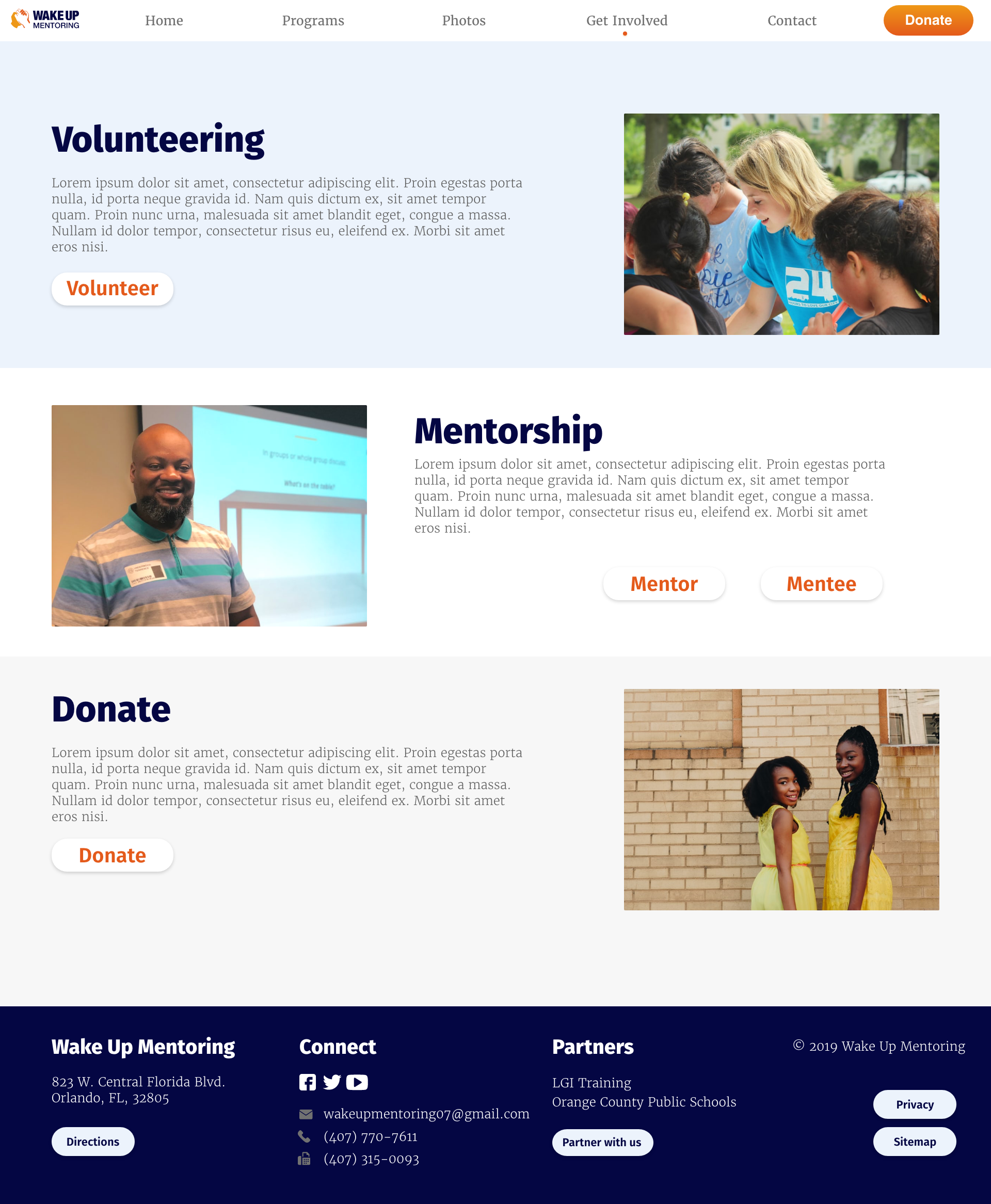
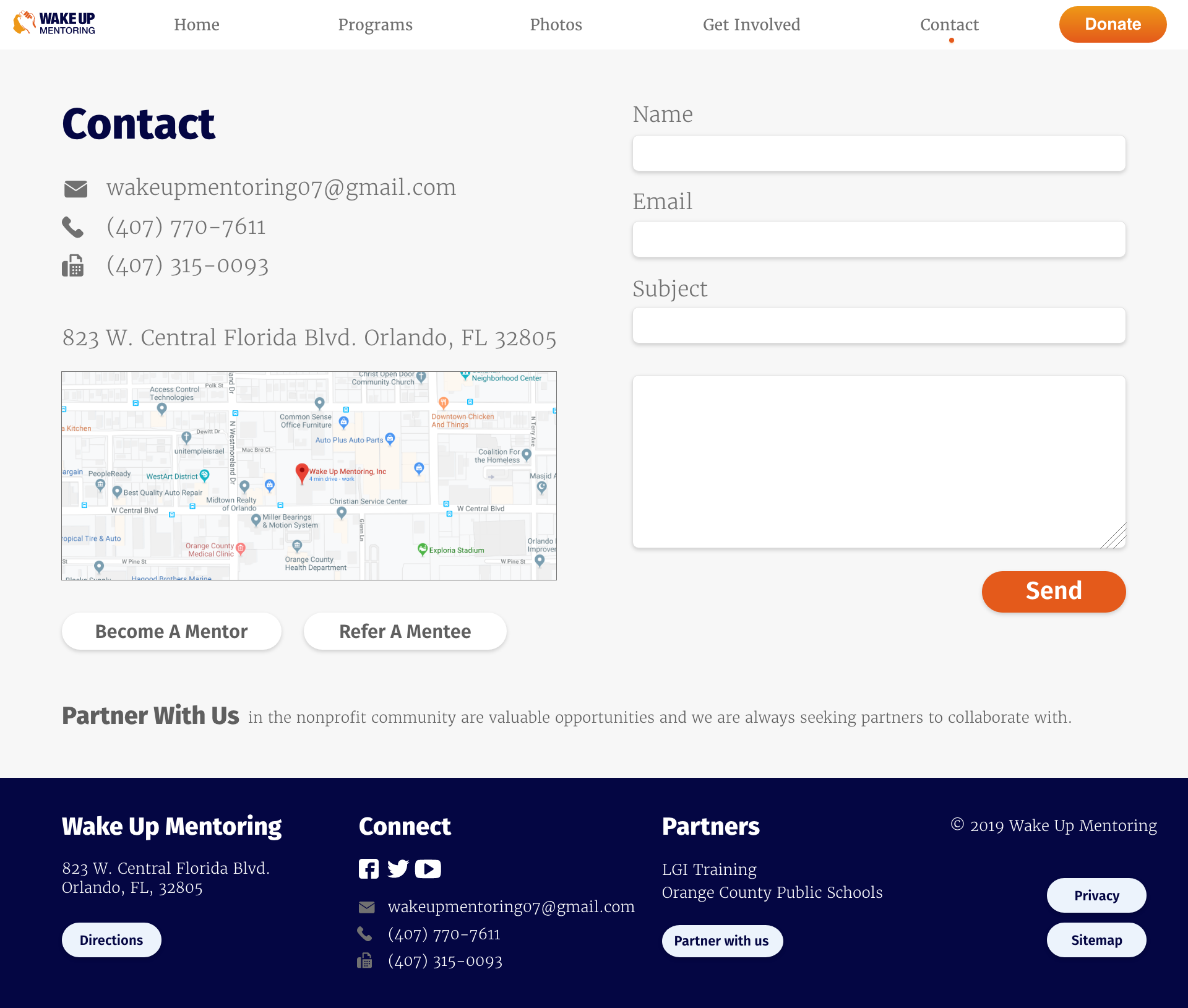
Wake Up Mentoring offers a variety of different services/programs and application forms to follow suit. With these aspects in mind the navigation and content heirarchy was one of the most important aspects in order to find the appropriate content within one or two clicks.
We limited the navigation to 5 links so that it was easily digestible for the user with clear call to action buttons to easily find applications related to their programs. Web based applications were implemented to minimize multiple document downloads and provide the convenience of applying online.
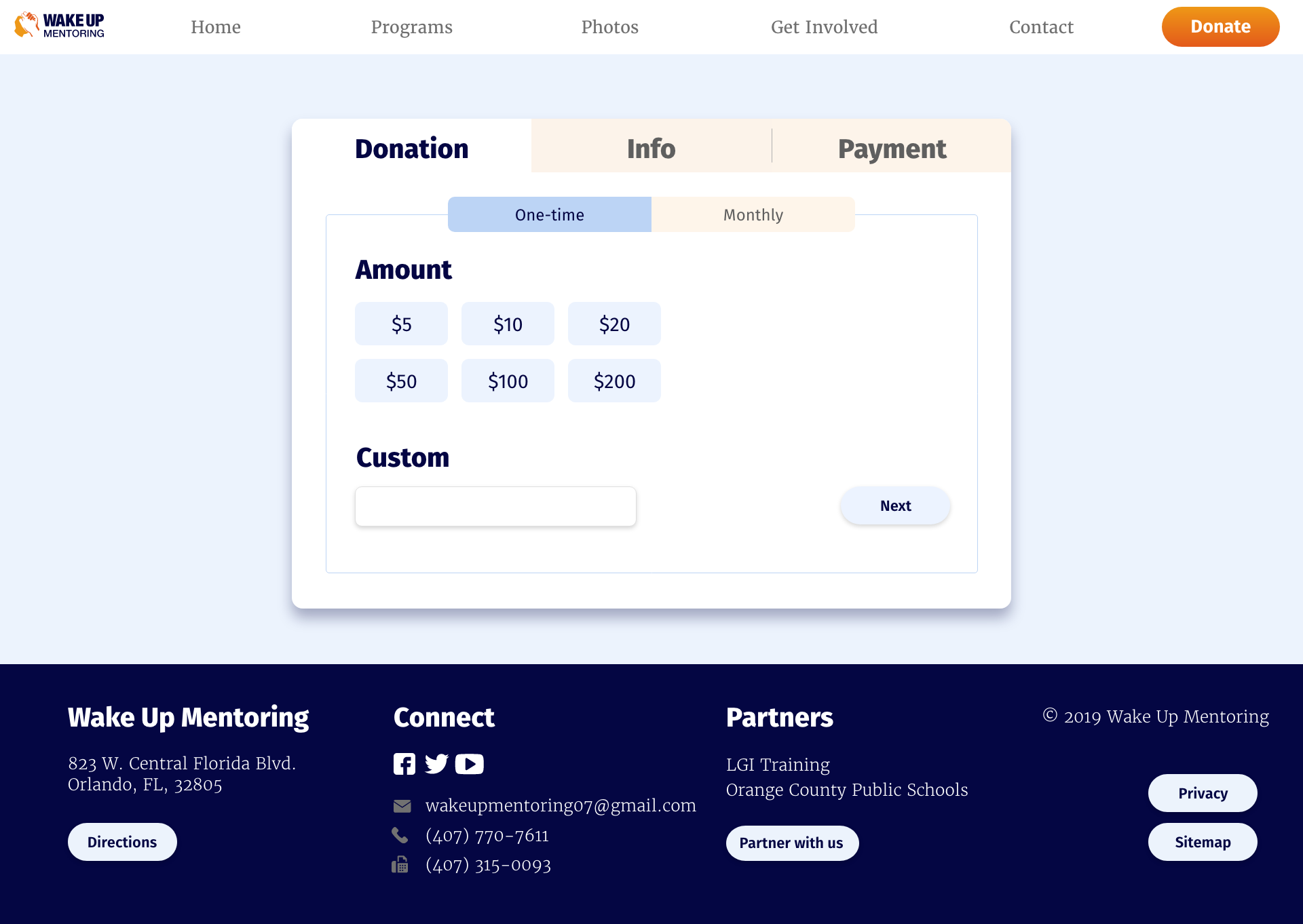
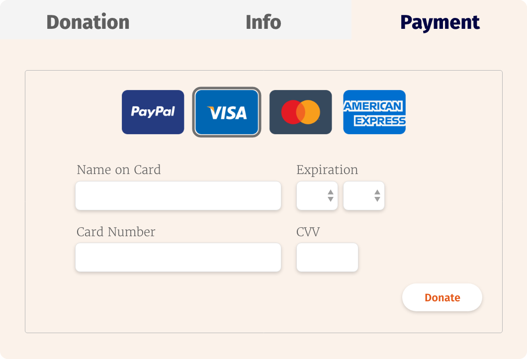
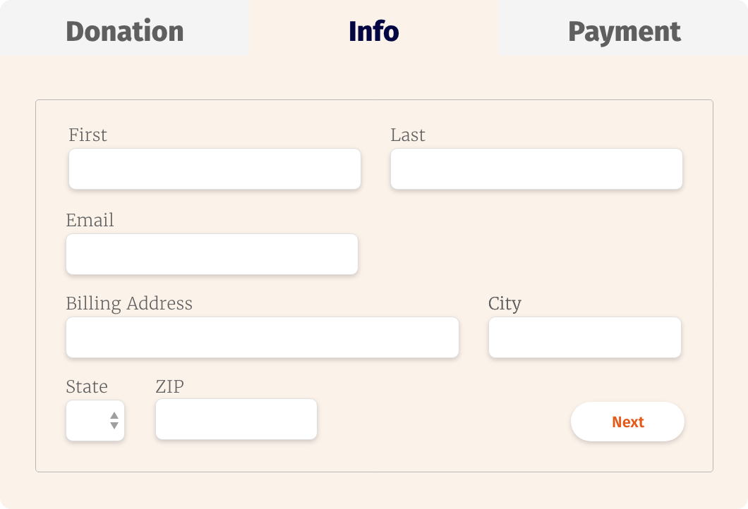
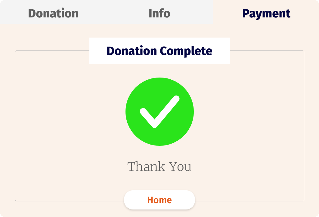
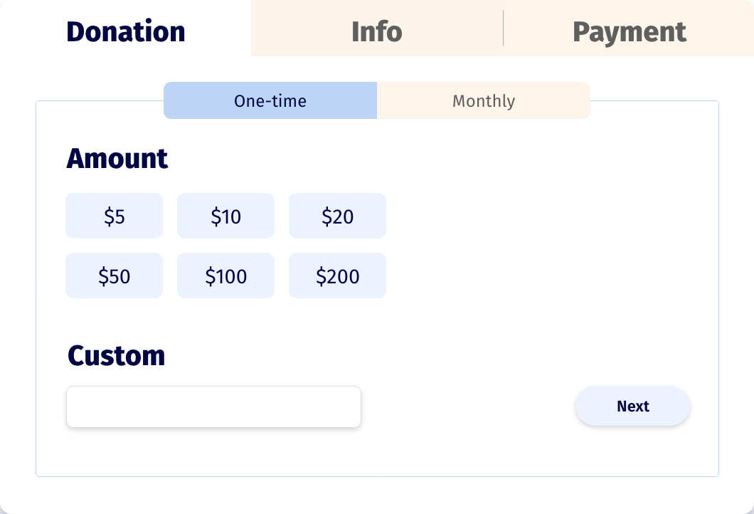
Instead of leading users to an external payment page, we designed a page for online donations, with convenient buttons with preset dollar amounts, with an option to input a custom amount.
View High Fidelity Mockup